
Let's recap a bit on what we actually did so far. We addressed the problem of a lacking design by building a foundation to work from in the form of sculpting a base of our project. This could be in a form of a stylescape that I talked about or can be as simple as document with sketches and brainstormed ideas. We further expanded our range of aesthetics by adding typography and color. I don't think I mentioned this last time, but you can also add elements such as shapes, a certain color profile that you like your images to be in, and so forth. You're not just limited to scoping out fonts and colors. That was the scope of my brand at the time.
And now we're at the fun part, and we're finally tying things together or as I would like to call it, "sewing". We have all these different threads and concepts and we just need to simply put them all together in some cohesive way. Now there's one thing to note here...you have to remind yourself what you're creating and what you're creating it for. i.e. a scarf is sewn a certain way because it needs to function as a scarf. The same principle applies when you're making a logo, website, banner, or an application. I'm aware there's some special 'cases' where people create websites to look like a brochure, or perhaps the logo looks like it would be a patch for a backpack, and in those cases, I believe the artist knows firsthand that they are breaking some rules for the purpose of creating the effect. So keep that in mind. It's okay to be methodical and logical in your designs. There's a reason why we haven't changed the design of a paper clip for so long.
Grid Systems & Framing
Before I got into the actual design, I wanted to understand more of what I was designing. Hopping back and forth with my mood board, I noticed a lot of repeated themes between all the images, and it was the fact that they all look structured in some way. All of them are sticking to some imaginary rules that a normal observer wouldn't notice.
Prior to this project, I have already read a few books, articles, and opted in some patreons to learn more about the grid. I understood what they were on a basic level, but I feel like with anything, basic knowledge isn't enough when you really want to understand how to utilize a tool. Everyone knows the basics of using a knife, but there's definitely a difference between a regular person and a chef using it. And as a designer, I think we all aspire to be a chef. A person that can walk into any kitchen and know what they can do with the ingredients and know what they can do with the tools presented. Of course, we can definitely "fake" it. Who's to say the chef's food is always "good", right? But, when it comes to business or trying to prove a point, humans tend to trust the "masters" more than they trust the guy in the corner. It's a weird world.
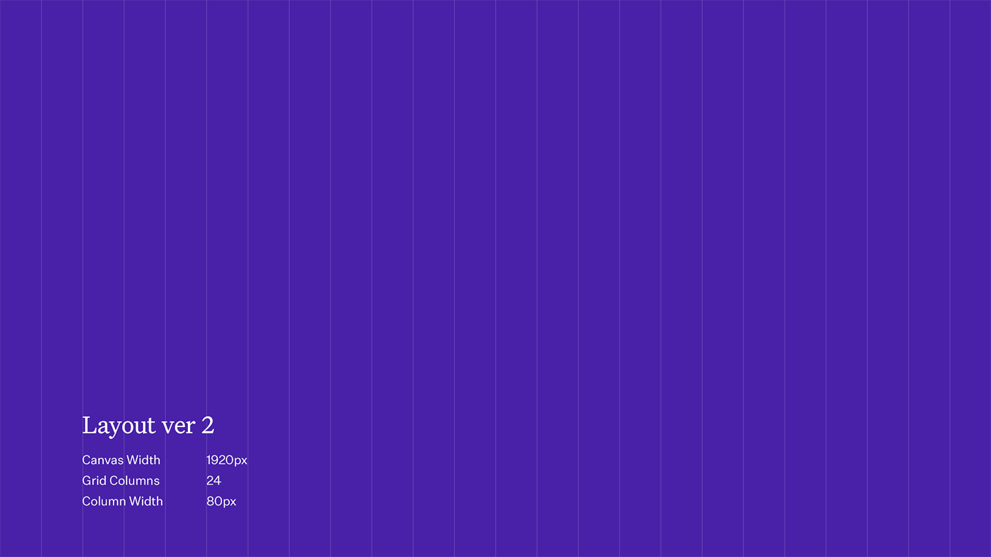
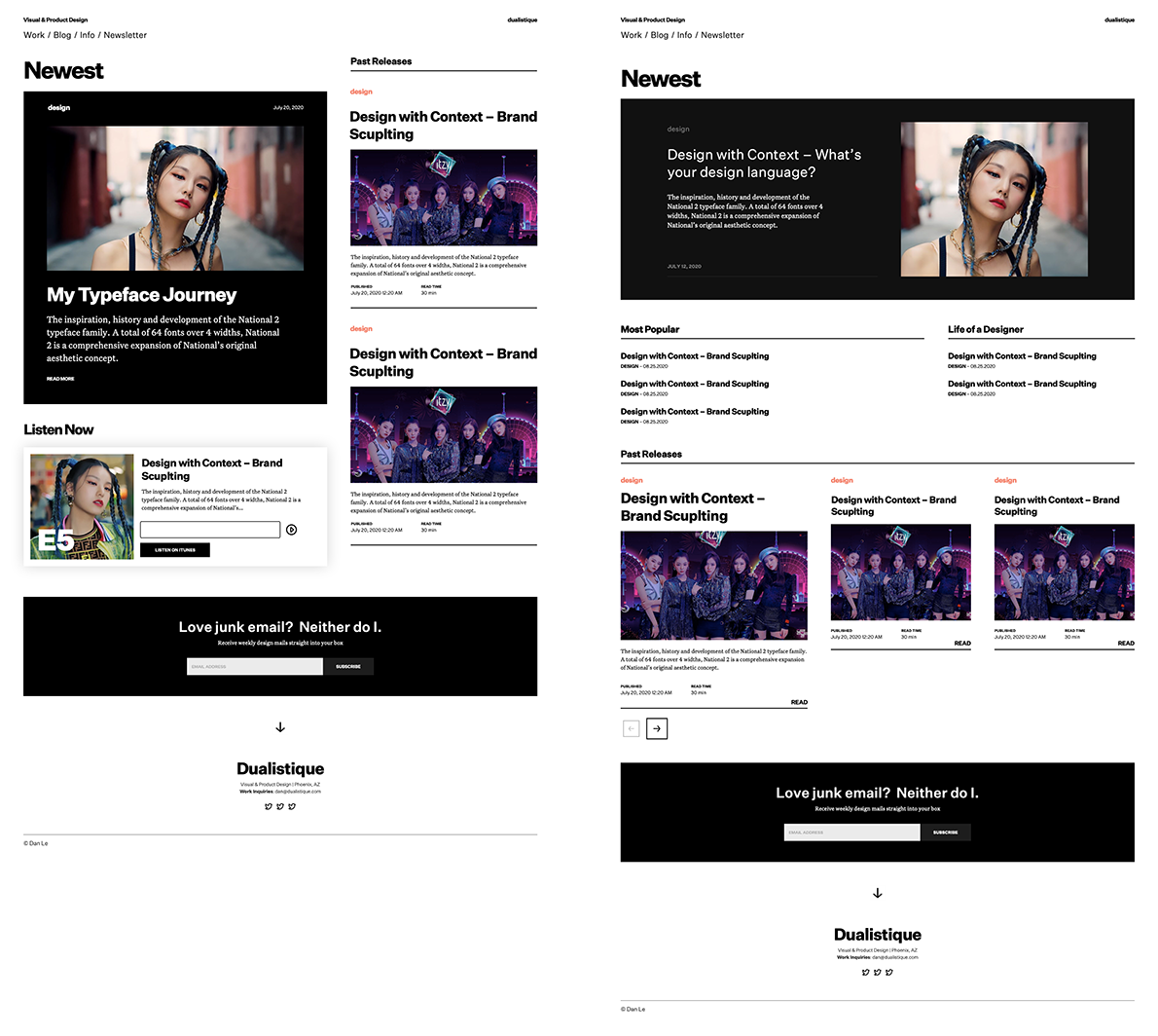
I went off tangent a bit, but, my point being is that I feel that our decisions as designers and creatives are more impressionable and solidified when it's done with a certain mindset in place. After all my research and practices, I decided to try out a 24-column grid that had no gutters. (for those that don't know, a gutter is basically a space between the column). Why the number 24? It's a good even number that can give you a varied ranges of columns. We can split it into, 1, 2, 3, 4, 6, 8, 12, or if in weird cases 24 columns. We'll probably stick to 1-4 columns just to limit ourselves, but at the same time, we're giving ourselves some freedom since we can be flexible with the spacing and sizes.
Iterative Design
Don't worry, this isn't a 5Head theory. It's actually true. I feel like many designers including myself feel regretful about a lot of our "final" designs because we never think about vetting out the options or possibilities. I think it's important to sketch down ideas even if they are so-called "dumb".
Don't be too hasty in turning down dumb ideas. Sometimes those are the most creative ones because they tend to follow less "rules". I find that the longer my design sessions are the more I start applying common design principles and practices and that's usually where we get the "oh this design looks like so and so". Another reason to vet out these ideas is to be able to record it in history. You now have a reference of it, and magically the idea is pushed out of your head giving you more room to think of ideas both practical and out of the box.
And now that we have a reference of it, it's not hard to look at your sketch board from a bird eye's view and maybe you'll end up remixing that idea or it could be useful in another project. As Bob Ross would say, these are the little magic happy accidents that many creatives strive for.
So you may be still wondering, how can creating a bunch of iterations lead to less options? Typically when planning a wedding cake or even food for the guests at the wedding, there's tons of options you can choose from. You can simply eliminate the options that don't taste good or eliminate options that you know people are allergic to. Same with design. You can clearly see what designs won't hold up well, or what designs don't fit your brand. But you won't have that comparison if you don't have those "bad" designs in play.

Gathering Feedback
After making all these iterations, I fell upon two choices I really liked but I wasn't sure where to land on. So I sneakily just asked on my instagram to see if people responded to it. Quite surprisingly people did. It'd be definitely interesting to see why they chose one or the other, but you know...I'm happy with both anyway, so honestly I couldn't go wrong. At the same time, I trusted the process that I went through and I have something I do enjoy. I'm sure things will change once I implement this design because unfortunately design and reality are two different things. What you see isn't necessarily what you get. Mockups is like a designer's version of a snapchat filter. It shows all the best qualities and does a good job at hiding the flaws.
However, there's an inner personality and beauty to the design and that's what I want to capture in the end implementation. Thanks for reading and listening. You'll probably see things moving around as I finally get this going. This is probably the 2nd to last episode in this series because I've covered all the steps of my process even though there's still a bunch of pages and content that I've still yet to design like my actual portfolio. But those will take on the same process and ideas of how I did this one, and I'll probably do a little update side episode just to keep everyone in the loop. I'll catch you guys at another time.
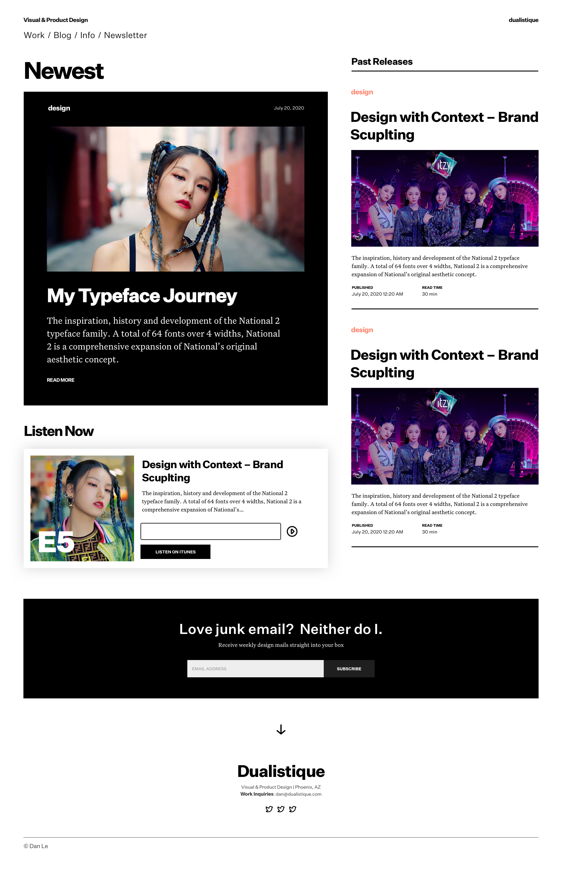
The Final Result
Credits to all "dummy" content used for designs. Some verbiage was taken from https://klim.co.nz. And much creds to the studios for images of ITZY.